Shabby

January 31, 2011

Comparison: Catherine Arley #674 & Milani - Cyberspace

Here we have the comparison I promised with #674 from Catherine Arley and Cyberspace from Milani. I applied three coats (no topcoat) and the picture is taken in normal daylight.

First the similarities: they're both baby blue polishes with prismatic particles. The application is very nice, they dry rather quickly and removing them is easy.
The differences: Cyberspace is a bit darker and more opaque; the Catherine Arley one seems to have a tini tiny bit more yellow in it. The prismatic particles in Cyberspace are chunkier and they give a scattered prismatic effect (best seen under bright light), whereas #674's prismatic particles are more delicate and they show off a nice rainbow even in low light.

I prefer the opaqueness of Cyberspace, but I love the rainbow effect of #674. What can I say? I'm happy owning both. :O

Thanks for watching!

January 29, 2011

Catherine Arley #674


#674 it is for today.. One of the Catherine Arley polishes I am most excited about (did I say that about the others too? They're all so great *sigh*). Look at it! Isn't that delicious and amazing? #674 is a light, baby blue prismatic polish. In the sunlight it's so freakin' awesome I couldn't believe my eyes. And indoors it doesn't dissapoint either (3rd picture), my nails look so soft and glassy, like little gems. I don't want to take it off. Never. I know I have to eventually, but you know what I mean, right? :) This baby blue polish made me think of Cyberspace from Milani, a comparison is coming up. I think the biggest difference lies in the prismatic effect, but we'll see!

There is one little downside: this polish is one of the not so pigmented CA's, after applying the first coat I was a bit worried. I ended up doing three, no topcoat added. As you can see it's beautiful on its own, but I think it's going to be great for layering experiments too!

Did I already mention I adore this one? :L

Thanks for watching!

January 28, 2011

Catherine Arley #800


Let me tell you first that photographing this polish, #800 from Catherine Arley, was SO frustrating. xo I love my camera, but sadly it does have some flaws, like picking up coral looking colours. So when you look at the pictures you have to add a good dose of coral to it, bright coral actually (like the colour dot on the left), 'cause this ain't a subtle polish. The prismatic effect of #800 isn't extreme, but clearly there. Just beautiful, I love it! It makes me wish there were more reddish prismatic polishes out there. I think this one would be fa-bu-lous for summer (hmm, I'm saying that quite a lot the past days.. Wearing bright, prismatic polishes in wintertime, great idea! Lets just say I'm well-prepared for summer, lol).

The application was very good, I'm pleasently surprised every time I try another Catherine Arley. They glide on so easy! #800 is very pigmented, this is two coats without topcoat.

And I have another comparison for you featuring one of the OPI Designer Series polishes, Reflection. What a great shade! The main difference you see is the golden flash Reflection has, whereas #800 has more of a pink flash. You can place both polishes in the same colour family, allthough #800 has more coral in it. They both have a nice amount of prismatic particles, but Reflection seems to have particles of different sizes and the effect is more scattered.

Well, that's it for now.. I wish you all a great day and thanks for watching! :h


January 27, 2011

Catherine Arley #803

normal daylight - sunlight
It may come to you as a surprise, but I have another Catherine Arley polish for you today! This time it's #803, a lime green prismatic polish. If ogre Fiona would want a sparkly nude, this is the one for her. :O It's very sparkly, especially in sunlight! The prismatic particles don't show a full-on rainbow, most of the time you'll see yellow, orange, green and a blue green. I hate to say it, but I don't like this colour on me at all, it's too yellow-toned and apparently that doesn't compliment my skin tone. But I'll definitely try it again in summertime, when I have a little tan!

I also have a little comparison for you guys with Hi-Tech from Milani. As you can see the Milani one is much lighter, less yellow-toned and less bright if that makes sense. Another difference is the size of the prismatic particles; the ones in Hi-Tech are a bit bigger. Application wise: no differences actually. If I had to choose one I'd go for Hi-Tech, because the colour looks better against my skin tone. 

The application of #803 was good! I wouldn't say it's sheer, but I still needed three coats. It applied very nicely, so I don't mind. :) I didn't use a topcoat.

Thanks for watching!


PS, I recommend looking at my post about #667 again, because I added a picture which shows real holo yummyness. Oh, how I love the sunshine! These polishes definitely come to life when sunlight is added.. :L

January 26, 2011

Catherine Arley #667

Enough with the pinky pink polishes for now. Today I have a non-pink Catherine Arley for you (I want to type Elizabeth in stead of Catherine áll the time, maybe because of Elizabeth Hurley? Arley.. Hurley.. ah, well) Uhm, where was I? :i This is #667, a grey prismatic polish. This one is some kind of a lighter, toned down version of Let's Do It In 3D from the China Glaze Kaleidoscope Collection. Sadly I don't have that polish to compare, but seeing the online swatches I can definitely see some similarities. The main difference would be the size of the prismatic particles, which seem to be bigger in the China Glaze one. #667 is one of the Catherine Arley polishes with a more visible prismatic effect, even in normal daylight (2nd picture) you could see some rainbow rockin'. This is already one of my favourites as I love grey polishes and I don't have anything like it!

The application was a dream, again. This is two coats with topcoat. The topcoat doesn't seem to dull the prismatic effect by the way, so that's nice too!

Thanks for watching!


PS, getting tired of looking at these Catherine Arley polishes yet? ^^

January 25, 2011

Catherine Arley #675

Another pink Catherine Arley today: #675, a warm pink. This polish has the same prismatic particles as #666 which I showed you yesterday. The prismatic effect of #675 looks less impressive to me on the nail though than the effect of #666, probably because of the more sheer base of the first one. Although this is a nice pink, it didn't wowed me, it's too warm for me I guess. 

I made a little comparison with OPI DS Signature (Mommy again). Signature is slightly cooler and the prismatic effect is definitely waaay cooler. For the observant viewers among you: you could already see them next to each other on the 1st picture. :)
The application of all the Catherine Arley's I tried so far is very nice, this one being no exception! #675 is quite sheer, even with three coats there's still some nail line visible.

Thanks for watching!

January 24, 2011

Catherine Arley #666

lamplight
Here we have #666 from Catherine Arley, a slightly dark cool pink with prismatic particles that are way more visible than the ones in #805 which I showed you earlier. I LOVE it, I'm almost speechless... the gorgeousness, aah :L 

I thought this could be some kind of love child of two OPI Designer Series polishes: Original (let's call it the Daddy for now) and Signature (which will be the Mommy, being the pink one, lol). So I made a quick comparison and well.. in a way it's true, #666 being a less holographic child then, with a bigger resemblance to Mom :). It's fun to compare polishes don't you think?
The application of #666 was great. This is one of the more pigmented Catherine Arley's I ordered, this is two coats without topcoat.

Thanks for watching!

January 22, 2011

Catherine Arley #805

Yesterday I showed you my Catherine Arley polishes that came in. I'm starting off by showing you the polish I was most curious about, Catherine Arley #805. This is a charcoal, almost black polish with prismatic/holographic glitter in it. Was it just me, hoping for a polish that could kill the lemming for the prismatic (and in my opinion best) version of My Private Jet from OPI? Well, #805 failed at that point.. Indoors this one looks like a dark polish with silvery mini glitter (2nd picture). Although the rainbow glitter isn't as visible as I hoped for, I think it's a beautiful polish. I love darks on my nails! I was lucky enough to catch one sunbeam (seriously) which resulted in the top picture. As you can see the coloured glitter is definitely there in all his subtleness. :O Looks promising for the more sunny days to come right? The application was perfection. So smooth and pigmented, this is two coats without topcoat.

Another thing: I noticed something strange. As soon as I upload my pictures in Blogger they seem to dull a bit, which I find quite annoying, as the pictures are very important to me! Anyone experienced the same? Edit: Deniz gave an awesome tip and now it's all how I want it to be! Thanks lady! 

Thanks for watching! :h

January 21, 2011

Catherine Arley polishes arrived safely! *phew*

Whose heart stopped seeing the Catherine Arley polishes Deniz posted a while ago? Mine! Mine! Mine! I couldn't resist and ended up ordering ten of these holographic pretties, but it took sooo long before they arrived I almost forgot about them. And don't get me started on the packaging :brow , let's just say it's a miracle they're all intact (glass against glass, seriously?).

But about the polishes: these Catherine Arley polishes are pure love! Can't wait to try them, so you can expect swatches soon! :O 

Thanks for watching!

January 20, 2011

OPI DS Extravagance

As you may know by now: I'm a big fan of polishes packed with prismatic/holographic glitter. Say what?! I'm almost addícted to the rainbows on my nails :L (well, who isn't?). Today I have one of OPI's Designer Series polishes on: Extravagance. This one doesn't have a crazy rainbow effect, but the multi-coloured glitter in this reddish purple polish is truly mesmerizing! I also included a picture of Extravagance without sunlight and I must say, even without bright light it's gor-geous.

The application was superb, this is two coats. I didn't apply a topcoat, for a glossy finish you don't have to add it, look how shiny it is on its own!

Thanks for watching and following! I can't believe almost 200 lovely persons decided to hit that follow button on my blog, thank you so much guys! :h

January 19, 2011

Color Club - Wild At Heart

Today I woke op and immediately thought: holo time! The sun was doing her very best, so why not give her some holo to play with? :O This is Color Club - Wild At Heart. Nothing new about this one, but in my opinion it's one of the best polishes evâh made. Purple and prismatic/holographic glitter, win-win!

The application was smooth. This is two coats with top coat.

Thanks for watching!

January 16, 2011

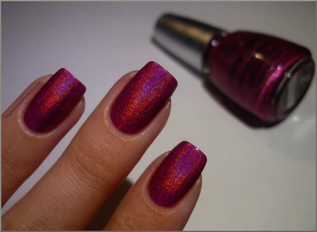
China Glaze - QT


This is QT from China Glaze's beloved OMG-collection. After seeing swatches of the Tronica-collection (a new range of - more subtle - prismatic/holographic polishes from China Glaze) I wanted to put one of the OMG-masterpieces from CG on my nails. Oh my, it's so gawgeous! QT is a dark magenta prismatic glitter polish. Everytime I put it on I'm like: :L Why are these polishes discontinued, why?! I want them all. Plús back-ups. Can't stand the thought of running out of them! (Not that I don't have enough polishes to wear for the next 200 years, lol).

Two smooth coats of awesomeness. No base coat, no top coat. Great for those moments when you want your nails to look fab fast!

Thanks for watching!

January 12, 2011

OPI - Green-wich Village + Dainty Daisies

I wanted cheer-me-up nails today. If I think cheery, I think green. When I started my collecting nail polish madness one of the polishes I wanted really really bad was Green-wich Village from OPI . So I ordered it. Like a year ago. Still untried. :o I'm ashamed. But.. today is the day for this wonderful bright yellow-toned green creme. I love it even more than I expected! And don't tell me it's not cheery, because it IS. The formula of Green-wich Village is quite sheer, but it applied nicely in three coats.

I decided to apply some more cheery happiness: daisies! Ok, actually they're just flowers with the same colours as daisies, but you know what I mean, right? :O I used a dotting tool and some old white polish and yellow acrylic paint. I luv daisies!
(Quick note: The first picture gives the most colour accurate representation of Green-wich Village. As soon as I was done painting the daisies it was so dark and gloomy I had to use lamp light for photographing.. )

Thanks for watching and following!! :h

January 10, 2011

Models Own - Purple Grey

I showed you the two on the left (Grace Green and Mushroom) earlier and now it's time for the third in line: Models Own - Purple Grey. Well, that's a fitting name, as this polish is a mix of purple and grey. An odd polish actually, it's playing tricks on me.. (sspooky!). Sometimes it looks more grey, sometimes more purple, but Purple Grey can look a little bit like a dark mauvish taupe too. I love it when a polish has different faces! :D
I had no application issues. The substance is a little thick and very pigmented. This is two coats plus topcoat.

Thanks for watching! 

January 8, 2011

Comparison: Models Own - Mushroom & Zoya - Kelly


I have a little comparison for you today: Models Own - Mushroom vs Kelly from Zoya. Kelly is one of my favourite polishes.. let's see if Mushroom can depose it. :D I removed Mushroom from my middle finger nail and replaced it with Kelly. To be short: Kelly is darker, less muted and a bit more blue-toned. I think I like Mushroom better. Yeah, really! I love the dusty look it has. Applying Kelly is easier though, because it's less thick. 

Thanks for watching!

January 7, 2011

Models Own - Mushroom

Today you're looking at the 2nd polish in line, Models Own - Mushroom. I must say, the colour doesn't scream mushroom to me, but ok. :) Mushroom (the polish) is a grey creme, but not just grey. Depending on the lighting it can look like a taupy grey, a purply grey, a blueish grey... hard to describe really. I love this one, very chique!

The formula... hmm, quite thick, but not too thick to handle. It's very pigmented, this is two coats, but maybe you can get away with one thick coat.

Thanks for watching!

January 5, 2011

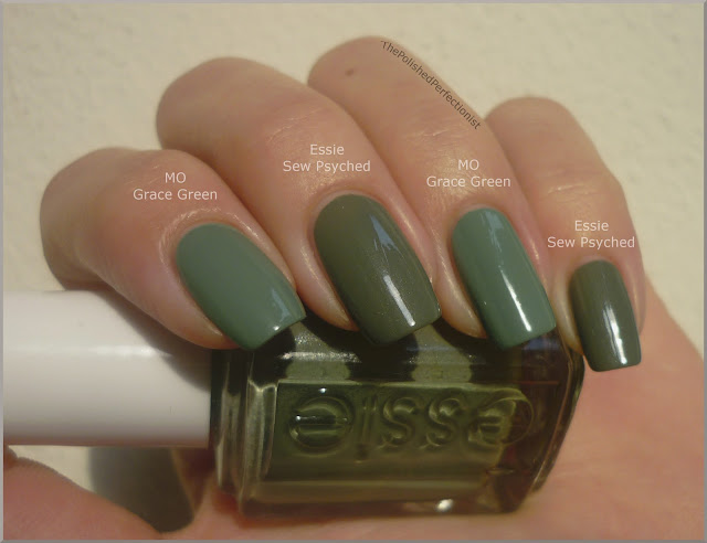
Comparison: Models Own - Grace Green & Essie - Sew Psyched

Yesterday I showed you Models Own - Grace Green. I promised a comparison with Grace Green and Sew Psyched from Essie. As soon as I saw Sew Psyched in the bottle I knew they were going to be to-tally different. And indeed... they are! Grace Green is a shimmerless creme, whereas Sew Psyched contains a subtle silver shimmer. Sew Psyched also has more yellow in it and is darker than Grace Green. So you'll need both. 

No, I'm kidding.. ;) But I dó like both, so I'm happy to have them. Sew Psyched applies better by the way, it's less thick, making it easier to spread the polish evenly on the nail. I applied two coats of both polishes, no top coat added.

Thanks for watching!

January 4, 2011

Models Own - Grace Green

A couple of days ago I received a package with my first Models Own polishes, yay! I bought the 'Autumn/Winter Collection'-set. In this set you can find the following polishes.. from left to right: Grace Green, Mushroom, Purple Grey, Purple Ash, Becca's Brown and Nude Beige. Look how well-behaved they stand in line! :O
First in line: Grace Green. It's a dusty greyish green creme (oh, I just can't describe this colour). Let's just say it's freakin' awesome! The formula is a little on the thick side, but the surface evens out really well after the second coat. The picture shows you the result without top coat. I have to say that Grace Green does remind me strongly of Sew Psyched from Essie, a comparison is coming up!

Thanks for watching!